Want to know how to make it on your own? Read the article below!
If you're a UI/UX developer, you've probably heard about Stripe.com and their uses of motion and design with their targeted audience in mind.
As I was exploring their website, I discovered their customers page and instantly, I was intrigued by their smooth scrolling bubble header and the concept was interesting enought that it caught my attention.
In this article, I'll explain on how I had attempted to recreate their scrolling bubble header.
Analysis
The mechanics are pretty simple to understand, these are the following:
- The bubbles are randomly generated and placed on page load
- Smooth animation of the up and down movements
- Infinite animation loop
A trivial problem, isn't it? Time to see if we can recreate it!
Step 1: Create the bubble
Let's write the CSS to create a simple bubble with a width and height of 150px and by giving it a border-radius of 50%.
    .stripe-bubble
    {
        width: 150px;
        height: 150px;
        border-radius: 50%;
    }
As for the logo, I inspected their code and figured out that Stripe combined all of their customer logos into a single image, also known as, CSS Spritesheet.

Performance-wise, it's a clever technique used to reduce the number of HTTP requests that your internet browser has to make on every page request.
Let's give the CSS spritesheet as a background-image property and adjust it enough to fit the size of one bubble.
    .stripe-bubble
    {
        position: absolute;
        width: 150px;
        height: 150px;
        border-radius: 50%;
        background-image: url('https://www.stripe.com/img/v3/customers/logos/header-logos.png');
        box-shadow: 0 15px 35px rgba(0, 0, 0, 0.1), 0 3px 10px rgba(0, 0, 0, 0.1);
        background-size: 1076px 1076px;
    }
There are about 43 logos, which means you'll have to create different logos by adjusting the background position property.
    .logo-1
    {
        background-position: 0 0;
    }

    .logo-2
    {
        background-position: 0 -154px;
    }

    .logo-3
    {
        background-position: 0 -308px;
    }
    ...
In the next step, using JavaScript, we'll create the classes for the bubbles and the header.
Step 2: Create a class for Bubble
Before we get in deep, let's create the foundation for our code, so that it'll make things neat and tidy and easier on the go. Below, I have created two classes: one is for the bubble and the other is for the bubble wrapper (no puns):
    class Bubble{
        constructor(){}
        update(){}
    }

    class BubbleMarquee{
        constructor(){}
        update(){}
    }
Great, you have created the classes, we can now use these to generate the bubbles dynamically in the next step.
Step 3: Bubble's scale and position

As you see in the image above, the logos are randomly placed and scaled. It's clear that there has to be some sort of a pattern, so I decided to take a look into their code:
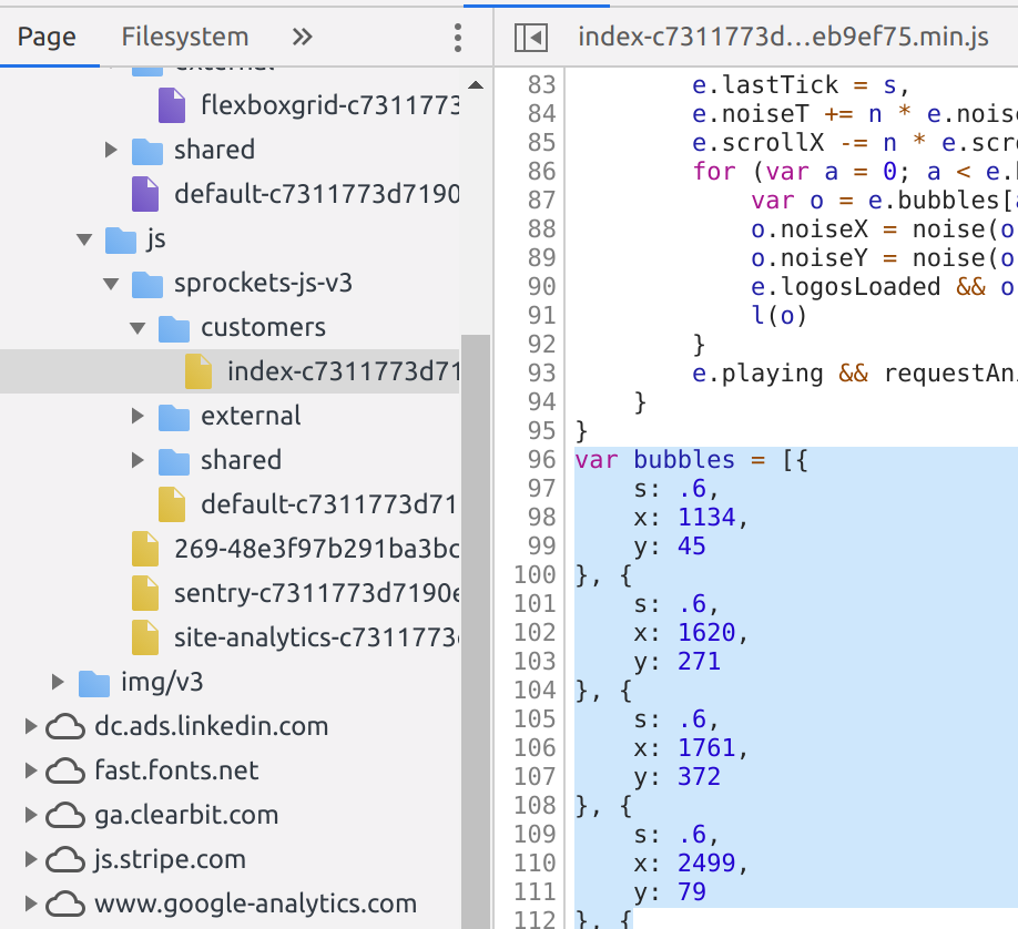
Aha! I discovered that the positioning and scaling of the bubbles are hard-coded and then the logos order are randomly shuffled. I won't be adding a randomizer but for now, let's add the bubbles with it's specifications and respective logos.
    const bubbleSettings = [
        {cssClass:'logo-imgAffirm', s: .6, x: 77, y: 1134 },
        {cssClass:'logo-imgAllianz', s: .6, x: 271, y: 1620 },
        {cssClass:'logo-imgAmazon ', s: .6, x: 372, y: 1761 },
        {cssClass:'logo-imgBookingCom', s: .6, x: 79, y: 2499 },
        {cssClass:'logo-imgCatawiki', s: .6, x: 334, y: 2704 },
        {cssClass:'logo-imgCityofBoston', s: .6, x: 356, y: 2271 },
        {cssClass:'logo-imgDeliveroo', s: .6, x: 226, y: 795 },
        {cssClass:'logo-imgDoordash', s: .6, x: 256, y: 276 },
        {cssClass:'logo-imgExpedia', s: .6, x: 365, y: 1210 },
        {cssClass:'logo-imgFitbit', s: .6, x: 193, y: 444 },
        {cssClass:'logo-imgGoogle', s: .6, x: 387, y: 2545 },
        {cssClass:'logo-imgIndiegogo', s: .7, x: 193, y: 1303 },
        {cssClass:'logo-imgInstacart', s: .7, x: 88, y: 907 },
        {cssClass:'logo-imgKickstarter', s: .7, x: 320, y: 633 },
        {cssClass:'logo-imgLyft', s: .7, x: 76, y: 323 },
        {cssClass:'logo-imgNasdaq', s: .7, x: 357, y: 129 },
        {cssClass:'logo-imgNat-Geo ', s: .7, x: 342, y: 1440 },
        {cssClass:'logo-imgRackspace', s: .7, x: 293, y: 1929 },
        {cssClass:'logo-imgReddit', s: .7, x: 198, y: 2135 },
        {cssClass:'logo-imgSalesforce', s: .7, x: 82, y: 2276 },
        {cssClass:'logo-imgShopify', s: .7, x: 182, y: 2654 },
        {cssClass:'logo-imgSlack', s: .7, x: 75, y: 2783 },
        {cssClass:'logo-imgSpotify', s: .7, x: 118, y: 1519 },
        {cssClass:'logo-imgSquarespace', s: .7, x: 233, y: 1071 },
        {cssClass:'logo-imgTarget', s: .7, x: 148, y: 1773 },
        {cssClass:'logo-imgTed', s: .7, x: 385, y: 2098 },
        {cssClass:'logo-imgTheGuardian', s: .7, x: 244, y: 2423 },
        {cssClass:'logo-imgTwitch', s: .7, x: 385, y: 901 },
        {cssClass:'logo-imgUber', s: .7, x: 111, y: 624 },
        {cssClass:'logo-imgWeTransfer', s: .7, x: 103, y: 145 },
        {cssClass:'logo-imgWish', s: .7, x: 367, y: 413 },
        {cssClass:'logo-imgXero', s: .7, x: 251, y: 2805 },
        {cssClass:'logo-imgYelp', s: .7, x: 75, y: 1990 }
    ];

    class Bubble {
        constructor(index, {cssClass, x, y, s=.9}){
            this.index = index;
            this.x = x;
            this.y = y;
            this.scale = s;
            this.cssClass = cssClass;

            this.el = document.createElement("div");
            this.el.className = `stripe-bubble ${this.cssClass}`;

            marqueeEl.appendChild(this.el);
        }

        update(){}
    }

    class BubbleMarquee{
        constructor(settings){
            this.bubbles = [];

            settings.forEach((setting, index) =>{
                this.bubbles.push(new Bubble(index, setting));
            });
        }
        update(){}
    }
Okay, now off to animating the bubbles!
Step 4: Animation
You could use absolute positioning properties like top and left but it'd be really expensive in terms of calculations, instead of that, you could use transform to move the elements.
this.el.style.transform = `translate(${this.x}px, ${this.y}px) scale(${this.scale})`;
As for the animation, you could use setInterval but don't do that, stop here and read about requestAnimationFrame.
    constructor(settings){
        this.bubbles = [];

        settings.forEach((setting, index) =>{
            this.bubbles.push(new Bubble(index, setting));
        });

        requestAnimationFrame(this.update.bind(this));
    }

    update(){
        this.bubbles.forEach(bubble => bubble.update());
        this.raf = requestAnimationFrame(this.update.bind(this));
    }
Alright, you've done it! It's animating and looks cool but hey, did you notice that there animation doesn't look stale but is more organic-like? That's because they have added some random movement to each bubble.
I took another peek at their code, I found out that they were using Perlin noise to smoothen the animation movements. Unlike, Math.random(), I got to know that it's an algorithm used to generate a sequence of randomness that has some order, which helps create a smooth, organic movement.
I didn't implement the algorithm instead I made use of an existing implementation written by Seph Gentle found on GitHub.
This is how your update() method should look like after adding the Perlin Noise:
    update(){
        this.noiseSeedX += noise_speed;
        this.noiseSeedY += noise_speed;

        var randomXPos = noise.simplex2(this.noiseSeedX, 0);
        var randomYPos = noise.simplex2(this.noiseSeedY, 0);

        this.y -= scrollingSpeed;

        this.xNoisePos = this.x + (randomXPos * noise_amnt);
        this.yNoisePos = this.y + (randomYPos * noise_amnt);

        if(this.y < -500)
        {
            this.y = canvas_width;
        }

        this.el.style.transform = `translate(${this.xNoisePos}px, ${this.yNoisePos}px) scale(${this.scale})`;
    }
After adding that, you have finally achieved what you wanted! Oh, you can find the source code for this project on my GitHub repository.
Conclusion
I hope you enjoyed reading this blog article and learnt something new. If you have questions, please send me your thoughts and I would be happy to help you out!
Thank you for reading!
Stay tuned for more!